

The Android icon spec is not complicated, but it is scattered. The store listing icon is documented in Play Console help, the adaptive icon geometry lives in the Android developer docs, and the density buckets are a third page again. So people ship an icon that looks right in Android Studio and then watch the top of their logo get shaved off on a Pixel.
Here is all of it in one place, with the one rule that causes most of the damage.
Every size, in one table
| Asset | Exact size | Format | Specified in |
|---|---|---|---|
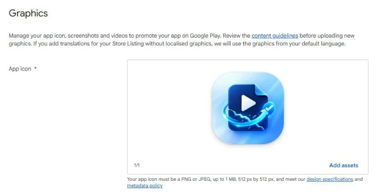
| Play Store listing icon | 512 × 512 px | 32-bit PNG with alpha, max 1024 KB | Play Console help |
| Feature graphic | 1024 × 500 px | JPEG or 24-bit PNG, no alpha | Play Console help |
| Adaptive icon layers | 108 × 108 dp | PNG or vector drawable | Android developer docs |
| Adaptive icon safe zone | 66 × 66 dp | — | Android developer docs |
Note the two different jobs. The 512 × 512 icon is what shows in the Play Store listing — it is uploaded to Play Console, not bundled in your APK. The adaptive icon is what sits on the home screen, and it ships inside the app as two layers.
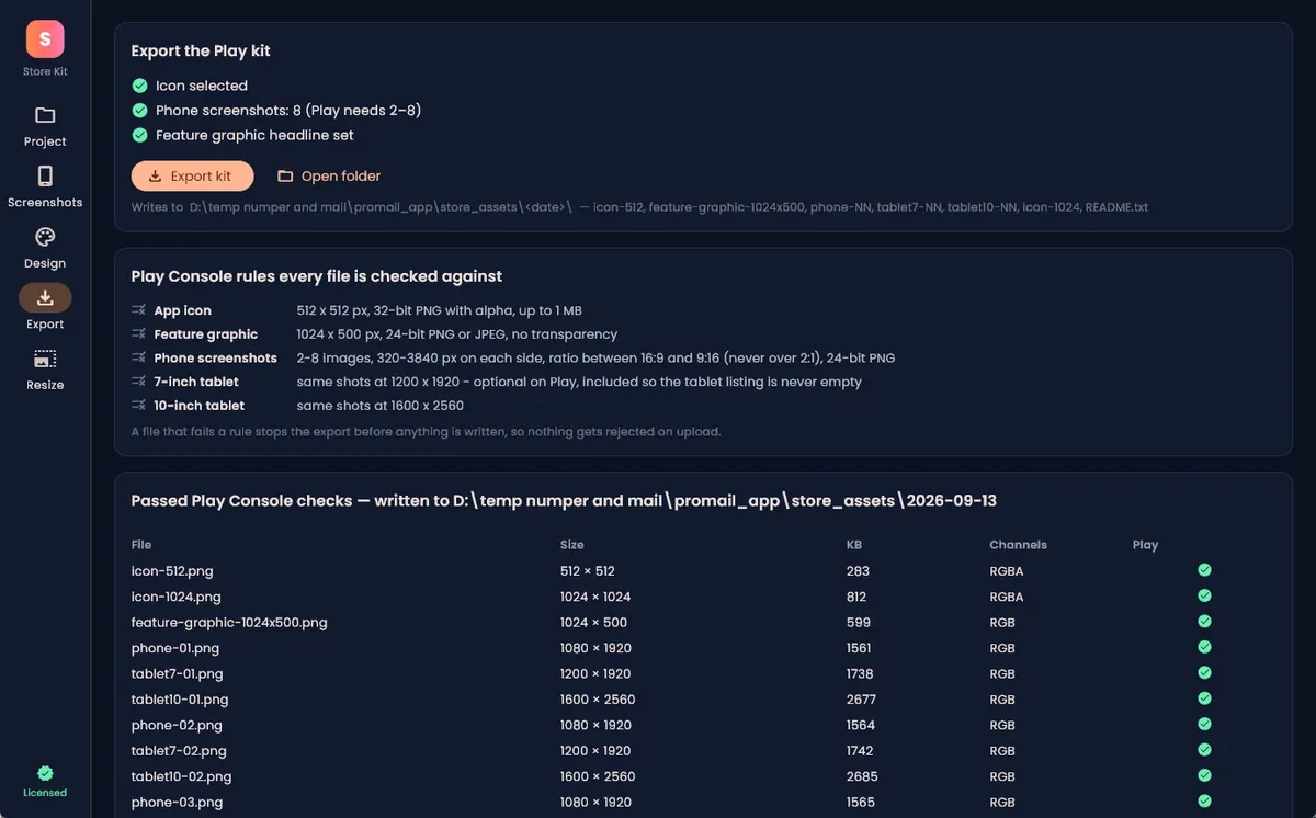
The store icon is the one people get wrong most often simply by exporting at the wrong size, which takes ten seconds to fix in the Google Play icon resizer — drop an image in, get a 512 × 512 PNG back, no upload required. The feature graphic resizer does the same for the 1024 × 500 banner, per the dimensions in the Play Console help linked above. And if the icon is one of a dozen listing images you still have to make, Store Kit makes all of them from the project folder — icon, feature graphic, phone and tablet screenshots — in about a minute.
The safe zone is the rule that bites
Adaptive icons are two layers — foreground and background — each 108 × 108 dp. Device manufacturers then apply their own mask over the top: a circle, a squircle, a rounded square, a teardrop. You do not get to choose which.
The developer documentation is specific about what survives that mask:
- The inner 66 × 66 dp is the safe zone. Nothing inside it gets clipped by any OEM mask.
- The outer 18 dp on each of the four sides is reserved for masking and for visual effects like parallax and pulsing.
- Your logo should sit between 48 × 48 dp and 66 × 66 dp — no larger.
That last line is the one that gets ignored. Designers fill the full 108 dp square because it looks balanced in isolation, and then a circular mask on a Samsung device cuts the corners off. The rule is blunt: a third of your canvas is margin, not design space. Anything meaningful outside the middle 66 dp is a gamble on which launcher your user has.
Density buckets for the launcher icon
Android scales from a baseline where 1 dp equals 1 px at mdpi, so the 108 dp adaptive layer exports at these pixel sizes per the density documentation:
| Density | Scale | Adaptive layer (px) | Legacy launcher icon (px) |
|---|---|---|---|
| mdpi | 1× | 108 | 48 |
| hdpi | 1.5× | 162 | 72 |
| xhdpi | 2× | 216 | 96 |
| xxhdpi | 3× | 324 | 144 |
| xxxhdpi | 4× | 432 | 192 |
If you ship a vector drawable for the adaptive layers, you can skip the raster export entirely — the system renders at whatever density it needs. Most modern projects do exactly that, and only export PNGs for the legacy round icon that older launchers fall back to.
The file-size limit nobody hits until they do
The store icon has a ceiling of 1024 KB, according to the Play Console requirements. A 512 × 512 PNG almost never approaches that — until someone exports a photographic icon or a heavily gradient design at maximum quality and lands at several megabytes.
If you get rejected on file size, do not re-export at lower dimensions. Keep 512 × 512 and compress instead; the target-size method in compressing an image to a size limit gets a store icon under the limit, and a flat icon rarely needs much.
A pre-upload checklist
Run these before you submit:
- Store icon is exactly 512 × 512, 32-bit PNG with alpha, under 1024 KB (Play Console help).
- Feature graphic is exactly 1024 × 500, JPEG or 24-bit PNG with no alpha.
- Adaptive layers are 108 × 108 dp with all essential artwork inside the middle 66 dp.
- Preview against multiple masks — Android Studio's adaptive icon preview shows circle, squircle and rounded square. Check all of them, not just the default.
- Background layer is fully opaque and fills the whole 108 dp. A transparent background layer produces a see-through icon on some launchers.
- No text in the icon. At 48 dp on a real screen, small type is unreadable noise.
Building for iOS too? The App Store icon is a different size again — the app icon resizer handles the 1024 × 1024 export. For web, the image resizer has a favicon preset.
Can the store icon be transparent?
The format is 32-bit PNG with alpha, so transparency is permitted, but the store renders the icon on backgrounds you do not control, so a fully opaque design is the safer choice. Once the artwork is right, the resizing is a solved problem: the Play icon resizer runs in the browser and gives you the exact 512 × 512 export the store expects.